Introduction – Why Pxless Is Trending in 2026
Over the past year, a quiet but powerful shift has been happening in the design world. Designers and developers are finally moving away from the old, frustrating habit of locking every single element to a fixed pixel. Instead, they are embracing a more flexible, human-friendly approach called “pxless,” and 2026 is the year this method truly goes mainstream. The main reason for this sudden popularity is simple: screens have become too varied for rigid, one-size-fits-all pixels to work anymore.
Think about the devices people use right now. From foldable phones and smartwatches to massive ultrawide monitors and even car dashboards, your website needs to look good everywhere. A pixel-perfect layout that works on a designer’s MacBook often breaks completely on a smaller Android tablet or a large TV screen. This frustration has made pxless not just a trend, but a necessary solution for modern, future-proof digital experiences.
What Is Pxless? (Simple Explanation)
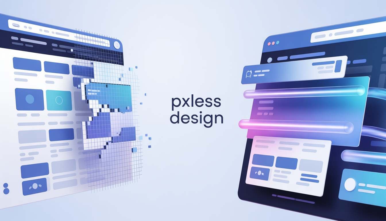
Let us break this down in the simplest way possible. The term “pxless” combines “px,” the abbreviation for a pixel, with “less,” meaning without or fewer. So, pxless is a design philosophy where you stop using fixed pixel values to define the size of your main layout, text, and spacing. Instead of saying “this button must be exactly 200 pixels wide,” you use flexible, relative units like percentages, `rem`, or `vw` that automatically adjust to fit any screen.
In other words, pxless does not mean removing all pixels from existence; your screen will always use tiny dots of light called pixels to show images. What it really means is that you are no longer forcing your design into a rigid, numbered box. You are building a fluid, adaptable container that stretches, shrinks, and reorganizes itself based on the device someone is using, creating a much smoother and more reliable experience for everyone.
Why Pixel-Perfect Design Is Failing Today
For many years, the idea of “pixel-perfect” design was the gold standard in the industry. Designers would create beautiful, fixed layouts in tools like Figma or Adobe XD, and developers would code those layouts to match every single pixel exactly. While this worked fine when most people viewed websites on similar desktop monitors, that world no longer exists. Today, the sheer variety of screen sizes, resolutions, and aspect ratios has made true pixel perfection almost impossible to achieve.
When you force a design into fixed pixels, you create a fragile system. On a large 4K monitor, a 1200-pixel wide container looks tiny and lost. On a small mobile phone, that same container causes horizontal scrolling and broken elements. Worse, if a user with low vision increases their browser’s default font size, pixel-locked text often cuts off or overflows its container. Pixel-perfect design assumes total control, but in reality, users have different devices, different settings, and different needs that a fixed pixel cannot accommodate.
READ ALSO :- cesta roman – Complete Guide, Meaning, History & Modern Relevance (2026)
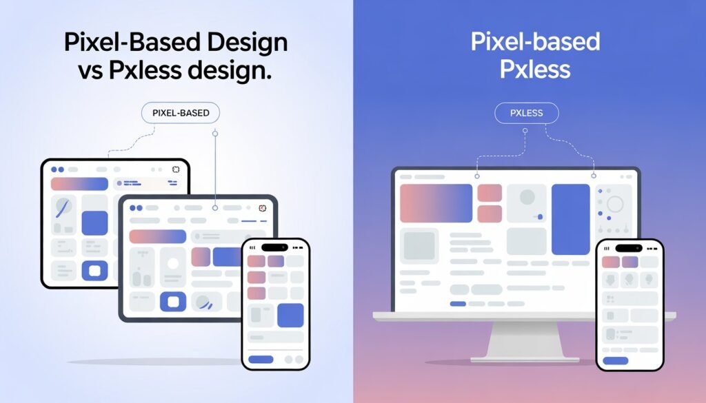
Pxless vs Pixel-Based Design
To truly understand the power of pxless, it helps to see it side-by-side with the old way of doing things. The table below highlights the core differences between these two approaches.
| Feature | Pixel-Based Design | Pxless Design |
| Main Unit | Fixed px values | Relative units (%, rem, em, vw/vh) |
| Responsiveness | Requires manual breakpoints | Naturally fluid and adaptable |
| User Accessibility | Often breaks when text is resized | Scales automatically with user settings |
| Maintenance | High; needs per-device fixes | Low; flexible by default |
| Future-Proofing | Limited; breaks on new devices | Highly adaptive to unknown future screens |
Layout Flexibility and Responsiveness
The biggest difference between the two methods is how they handle layout changes. A pixel-based layout is like a puzzle with fixed pieces; if you try to fit it into a different sized frame, the pieces either fall apart or leave huge gaps. This forces developers to write many extra lines of code using “media queries” to fix the layout at specific screen widths, which is time-consuming and often results in a choppy user experience.
On the other hand, a pxless layout is more like a bowl of water. It naturally fills whatever container you put it in, taking the perfect shape without any extra effort. By using modern CSS tools like Flexbox, Grid, and relative units, a pxless layout adjusts its columns, spacing, and alignment in real-time. This creates a smooth, continuous responsiveness that feels more organic and less “mechanical” than traditional breakpoint-based designs.
Scalability Across Different Screen Sizes
Scalability is another area where pxless design shines. Imagine you have designed a beautiful dashboard with pixel-based charts and text. When you view this dashboard on a 32-inch monitor, the text might be too small to read comfortably from a distance. To fix this, you would have to create a completely separate layout or use complicated scaling hacks. Pxless solves this problem at its core by using viewport units (`vw`/`vh`) and the `clamp()` function.
With pxless, your font sizes and component widths are tied to the size of the user’s screen or their root font preference. So, a heading that looks balanced on a phone will scale up proportionally to look equally balanced on a television. This proportional scaling ensures that your design’s visual hierarchy and readability remain consistent from the smallest wearable screen to the largest projector display, without you having to write a single extra line of code for each new device.
Core Principles of Pxless Design
Adopting a pxless mindset means embracing a few key principles that guide every design decision you make. The first and most important principle is to prioritize relative units over fixed ones. This means using `rem` for typography and spacing, `%` or `fr` units for grid columns, and `vw`/`vh` for full-screen elements. You should almost never use a fixed pixel value for anything that needs to scale, like container widths, font sizes, or margin values.
The second core principle is to design the relationship between elements, not their absolute size. Instead of asking “how wide should the sidebar be?”, you ask “the sidebar should take up one-third of the available space.” This relational thinking is what makes pxless systems so resilient. Finally, you must start with content-first, mobile-first thinking. By designing for the smallest screen first and using flexible rules to expand up, you naturally create a layout that is lightweight, fast, and perfectly adaptable to any environment.
Real-World Examples of Pxless
You might be surprised to learn that you have already experienced pxless design on many major websites, even if you did not know the name for it. A perfect example is GitHub, the popular platform for developers. GitHub uses a fluid, `rem`-based spacing and typography system. If you zoom in on a GitHub page or increase your browser’s default font size, the entire interface scales cleanly, and buttons and text fields maintain their proportions without breaking.
Another great example is Stripe, an online payment company. Their documentation and marketing site are masterclasses in flexible design. They avoid fixed-width containers and instead use `max-width` with percentages, allowing the content to breathe on any screen size. Their typography uses a fluid scale that adjusts smoothly. By studying these real-world applications, you can see that pxless is not just a theoretical idea; it is a proven, battle-tested strategy used by some of the most successful tech companies in the world to ensure their products work flawlessly for everyone, everywhere.
How to Implement Pxless (Step-by-Step Guide)
Implementing pxless does not require you to throw away your entire codebase and start from zero. Instead, you can follow this simple, step-by-step roadmap.
Step 1: Change your font sizes. Go into your CSS file and replace all instances of `font-size: 16px;` with `font-size: 1rem;`. This simple change makes your text respect the user’s browser settings, which is the foundation of pxless accessibility.
Step 2: Convert your layout widths, Find fixed-width containers like container { width: 1200px; } and change them to width: 90%; or max-width: 1200px; width: 100%.
Step 3: Use modern CSS for spacing. Replace pixel-based `padding` and `margin` values with `rem` units so that spacing scales with text size.
Step 4: Build grids with fr and %.Instead of saying `.sidebar { width: 300px; }, say .grid { display: grid; grid-template-columns: 1fr 3fr; }`. This tells the browser to always give one part of the space to the sidebar and three parts to the main content.
Step 5: Implement fluid typography using clamp(). For headlines, use font-size: clamp(1.5rem, 5vw, 3rem); to let text scale smoothly between a minimum and maximum size. Test your changes on different devices, and you will immediately see the difference.
Pxless and SEO – Does It Improve Rankings?
Yes, adopting a pxless approach can have a direct and positive impact on your website’s SEO rankings, though not through a specific “pxless algorithm.” Search engines like Google use page experience signals, including mobile-friendliness, loading speed, and visual stability, to rank websites. Pxless design directly improves all three of these core metrics. Because flexible layouts reduce the need for complex CSS hacks and extra media queries, your code is cleaner and loads faster, which is a major ranking factor.
Furthermore, pxless design virtually eliminates a common SEO problem called layout shift. You have probably experienced this yourself: you are trying to click a link on a page, but a picture loads a second later and pushes the link down, causing you to click the wrong thing. This is called a Core Web Vitals issue, and it hurts your rankings. By using relative units for image containers and text, pxless ensures space is reserved properly, resulting in a much more stable, user-friendly experience. Bounce rates drop, time on site increases, and Google sees your site as high-quality and ranks it higher.
Benefits of Pxless Design
The benefits of switching to a pxless workflow are numerous, but a few stand out as game-changers for most teams. First, improved accessibility is a huge win. Millions of people rely on browser zoom or custom font sizes to read comfortably. A pxless website welcomes these users, while a pixel-locked website often locks them out. Second, you get future-proofing for free. When a new foldable phone or a smart glasses browser comes out next year, your pxless design is already ready for it, saving you thousands in redesign costs.
Third, development speed and maintenance become much easier. When your design system uses rem-based tokens and fluid grids, you no longer have to debug weird breakpoint issues or create device-specific stylesheets. A single, flexible system handles everything. Finally, user trust and conversion rates improve. When a user lands on your site on any device and it looks professional, works smoothly, and respects their zoom preferences, they are much more likely to trust your brand and complete a purchase or sign up for your newsletter.
Common Mistakes in Pxless Design
Even with the best intentions, designers and developers can make mistakes when first learning the pxless mindset. One of the most common errors is mixing units inconsistently. You might set your main container to width: 90% (good), but then set an inner image to `width: 200px` (bad). That fixed pixel image will break the fluidity of your layout on smaller screens, causing overflow. The solution is to be consistent: if the outer element is fluid, the inner elements should use relative units like % or max-width: 100%.
Another frequent mistake is forcing all elements to be fluid. Remember, pxless is about where fixed pixels fail. It is perfectly fine, and even recommended, to use `px` for very small, static details like `border: 1px solid #ccc` or `box-shadow`. These do not affect the overall layout. The mistake is using pixels for large structural elements like sidebars, headers, or font sizes. Finally, many forget to test on real devices with different zoom levels. A layout that looks fluid on a desktop browser can still have hidden issues when a user on a phone increases their default font size to 1.25rem. Always run accessibility tests.
Future of Pxless (2026–2030 Trends)
Looking ahead from 2026 to 2030, the pxless philosophy will only grow more dominant as new technologies reshape how we interact with screens. The biggest trend to watch is CSS Container Queries. Unlike old media queries that look at the whole browser window, container queries allow a component to look at the size of its own parent container. This is the holy grail of pxless design because it means a “card” component can rearrange itself perfectly whether it is placed in a narrow sidebar or a wide main area, without any fixed pixel logic.
Another major trend is the rise of design tokens and AI-assisted layout. Design systems are moving away from hardcoded pixel values to token-based variables (e.g., `spacing-md: 1rem`). AI design tools are being trained on these token systems, allowing them to automatically generate perfectly fluid, pxless layouts from a simple prompt. As virtual reality (VR), augmented reality (AR), and spatial computing become more common for the web, the very concept of a fixed “screen” will disappear. Pxless principles, focused on relative scale and adaptability, are the only way to design for a world where the user’s display is the entire room around them.
Conclusion
The days of obsessing over “pixel-perfect” designs that only work on one screen are fading fast. In 2026, the smartest designers and developers are embracing pxless, a simpler, more powerful philosophy built for the real, multi-device world. By moving from fixed pixels to flexible units like `rem`, `%`, and `vw`, you unlock a host of benefits including better accessibility, higher SEO rankings, faster load times, and complete future-proofing against tomorrow’s unknown devices.
Making the switch does not require a complete overhaul overnight. Start with one small step, like changing your font sizes from `px` to `rem`, and feel the difference. A pxless approach is not about losing control; it is about creating a stronger, more resilient relationship between your content and your users. It is about building websites that are not just beautiful in one place, but beautiful and functional everywhere. That is the real power of pxless.
FAQ Section
1. What does “pxless” mean in web design?
Pxless is a design philosophy that minimizes or eliminates the use of fixed pixel units (`px`) for layouts, spacing, and typography. Instead, it uses flexible, relative units like `rem`, `em`, and percentages to create designs that adapt smoothly to any screen size or user setting.
2. Is pxless design better for SEO than fixed-pixel design?
Yes, generally it is. Pxless design improves page load speed, ensures mobile-friendliness, and reduces disruptive layout shifts (a Core Web Vital). These factors directly contribute to a better user experience, which search engines like Google reward with higher rankings.
3. Does pxless mean I can never use pixels again?
Not at all. Pxless is a philosophy, not a strict law. It is perfectly fine to use fixed pixels (`px`) for tiny, non-structural details that should not scale, such as 1px borders, decorative shadows, or fine-detail icons. The rule is: use pixels for detail, use relative units for structure and text.
4. How do I start converting my existing website to pxless?
Start small. The easiest first step is to go into your CSS and replace your body font size with 16px and change all other text sizes to rem units. Next, convert fixed-width containers (like 1200px) to percentages (like 90%). Finally, use CSS Grid with `fr` units for your main layout columns.
5. What are rem and em units in pxless design?
Rem stands for “root em” and is relative to the root font size of the browser (usually 16px). em is relative to the font size of the immediate parent element. In pxless design, `rem` is generally preferred for consistency, as it scales predictably from a single source (the user’s browser settings).